3. Monitoring Overview
You have an account, and it’s sending data to Tideways using the Tideways daemon. Now, let’s get an overview of how to monitor the information that you’re collecting.
Before you dive on in, though, let’s assume that our application, which is sending data to Tideways, is this one, an e-commerce shop.
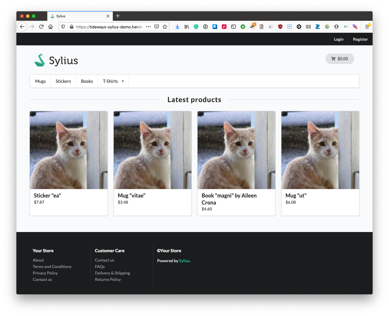
| In case you’re interested, it’s powered by Sylius, which is an open-source e-commerce platform, based on Symfony. You can see that it has category pages, a top-level navigation bar, checkout, and support pages; all the components that you’d expect in an e-commerce shop. |
The Main Application Performance Screen
Now, let’s get an overview of how to do monitoring in Tideways. The main application performance screen in Tideways is composed of several sections. These are:
Let’s step through each one, starting with the Service & Environment Switcher.
The Service & Environment Switcher

By default, the Service and Environment Switcher contains:
-
Two services: cli and web (however, in this example, there is a third, named "admin").
-
One environment: production; and
-
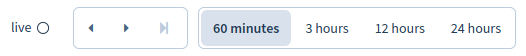
Four time frames: 60 minutes, 3 hours, 12 hours, and 24 hours.
The Service and Environment Switcher, as the name implies, lets you separate traffic based on services and environments. The services feature allows you to group transactions into different sets that belong together and get aggregated together in their own chart and overall response time. Services could include an admin backend, a command-line interface, and a web interface. Environments could include testing, staging, and production.
Services
By default, all monitored requests are assigned to the "web" service, which is also the default service shown. To collect data using a different service name, you can use one of three different configuration mechanisms. These are:
-
Set the
tideways.servicevariable inside your tideways.ini, php.ini, or webserver ini directives.tideways.service=admin -
Set the
TIDEWAYS_SERVICEenvironment variable.TIDEWAYS_SERVICE=admin -
Set it programmatically in your PHP code, such as the example below.
$request = Request::createFromGlobals();
if (stristr($request->getPathInfo(), "/admin") !== FALSE) {
    \Tideways\Profiler::setServiceName('admin');
}
|
Service names can only contain:
If they contain spaces or other non-alphanumeric characters, they will be rejected. |
Environments
Extra environments, in addition to production, can be added, up to the limit of your subscription.
There are two ways to do so.
The first is by setting the --env flag to the name of the desired environment by using the TIDEWAYS_DAEMON_EXTRA variable.
# Update with the desired environment name
TIDEWAYS_DAEMON_EXTRA="--env=<environment name>"
The second is by setting the TIDEWAYS_ENVIRONMENT variable to the name of the desired environment.
TIDEWAYS_ENVIRONMENT=stagingBoth of these are set in /etc/default/tideways-daemon.
If you’re using Docker, you can set these in the Dockerfile.
Please bear in mind that the TIDEWAYS_DAEMON_EXTRA variable only works for the prepackaged Debian and RPM packages with the Systemd service definitions.
The Application Performance Overview
Now let’s look at the charts, starting with the topmost one: the time selector. This bar graph shows all of the activity in your account up until the most recent transactions and, by default, highlights the most recent 60 minutes of activity. This will be harder or easier to detect, based on the amount of activity in your account. You can see it over on the far right-hand side of the graph, in white.
| Select 3 hours, 12 hours, or 24 hours to see how the highlight and information changes. |

In addition to the default options, you can also select a time period by clicking and dragging across a selection. This is handy when the period you need to focus on isn’t within one of the four time ranges. What’s more, you can move the slider from right to left to move back to a period much earlier in your transaction period, if you need to, to access that period. Have a play around with the graph to familiarize yourself with it.
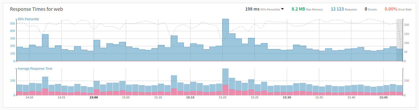
The Application Performance Overview shows your application’s performance with response times measured in 95% percentiles. By hovering over each minute, you can see the exact response-time and the number of requests that were measured.
Blue bars represent the response time, with their values stored in the y-axis on the left-hand side of the chart. Red bars represent the number of errors. The dashed gray line represents the number of requests, with their values stored in the y-axis on the right-hand side of the chart.
On the top right-hand side, for the currently selected period, you can also see:
-
The aggregated 95% response time This can be changed to 50%, 90%, 99%, and average
-
The number of requests
-
The failure-rate; and
-
The maximum memory
Lastly, you can see the exact numbers at a point in time, if you mouse-over the chart.
What Are Percentiles?
I’ve talked about percentiles a bit in this section. If you’re not familiar with them, you may be wondering what they are. So, here is an excellent explanation from ThoughtCo:
In statistics, percentiles are used to understand and interpret data. The nth percentile of a set of data is the value at which n percent of the data is below it. In everyday life, percentiles are used to understand values such as test scores, health indicators, and other measurements.
Definition of a Percentile in Statistics and How to Calculate It
Next, have a look at the following animation.
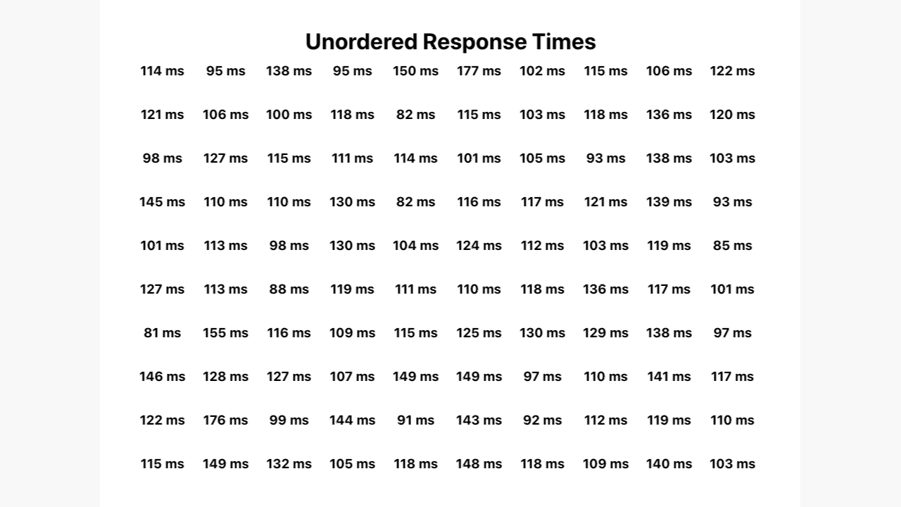
It starts off showing a list of 100, randomly sorted, response times. Then, the response times are sorted by the quickest response time at the top left to slowest at the bottom right. After that, a rank out of 100 appears for each one.
And finally, the 95th number ranks becomes highlighted in red, while the others remain listed in gray. This final coloration step, hopefully, makes it easier to see that the final five numbers make up the 95th percentile for this data set.
The Response Time Graph
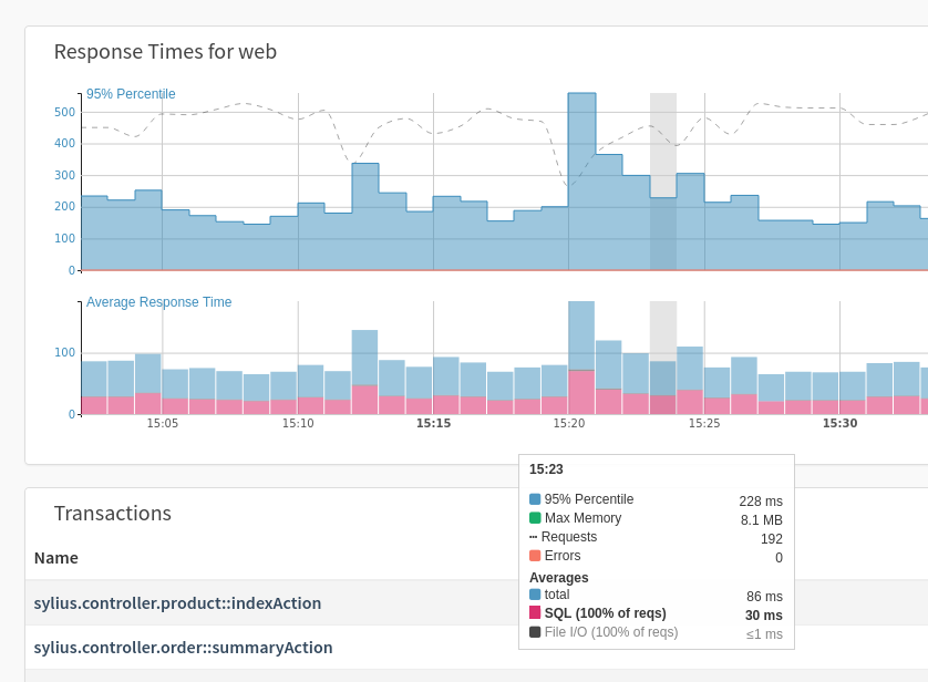
Let’s get a better understanding of them with respect to application performance. Looking at the Response Times graph, you can see that the 95th percentile for requests is 239 ms. This tells us two things:
-
95% of all requests take no longer than 239 ms; and
-
5% of all requests can take longer (with the longest taking up to 250 ms).
This is quite different from the average response time. In this case, the average response time is 87 ms. If you were to use that, you would likely think that our application was performing quite well, as the value is so low, and that there is nothing much to worry about.
From looking at these two numbers, you can quickly see that the average response time can be misleading. This is because the calculation of averages assumes that outliers are similarly distributed for both faster and slower responses.
But the truth in application responses is that outliers in slower responses are often much stronger than faster ones. By using percentile’s, you get a much more accurate understanding of the state of our application.
List of Transactions
Underneath the Response Times charts is the transactions list.
A transaction identifies a specific code-execution path in your application and given a unique name.
In web-based MVC applications, the names often translate as Controller + Action.
| You don’t need to take care of the transaction names yourself if you are using a supported framework, such as Symfony, Laravel, Magento, and Shopware because Tideways automatically detects the transaction name. |
Using the concept of transactions, the profiler can:
-
Aggregate monitoring data, such as percentile, requests, and failure rate, for just this transaction
-
Aggregate similar profiling traces for you
-
Compare profiling traces
-
Look for performance regressions; or
-
Make optimization suggestions
You could theoretically use URLs for names; however, they are not unique enough. For example, take a web shop with category-based product pages, such as:
-
GET /shoes -
GET /coats -
GET /socks
The same controller would serve each of these URLs - and many hundreds more.
Each URL would receive very little traffic and very little profiling data.
Consequently, comparisons and alerts would be useless in this scenario.
This is why Tideways uses the Controller + Action names for transaction names.
The Transactions List
The transaction list is filtered based on the currently selected time range. What you see is a collation for all of the endpoints that were requested. For each one, you see:
-
The amount of memory used
-
The impact
-
The number of failures
-
The number of problem responses
-
The number of requests
-
The typical response time
What you also see, based on all the data for that time range, is:
-
The 95th percentile response time
-
The failure rate percentage
-
The number of traces
-
The total number of requests
| Note the empty circle next to each one. This is used when comparing two-time ranges and shows whether the values are improving or declining. |
| If there is at least one trace, then a list of traces will be visible underneath the list of transactions. |
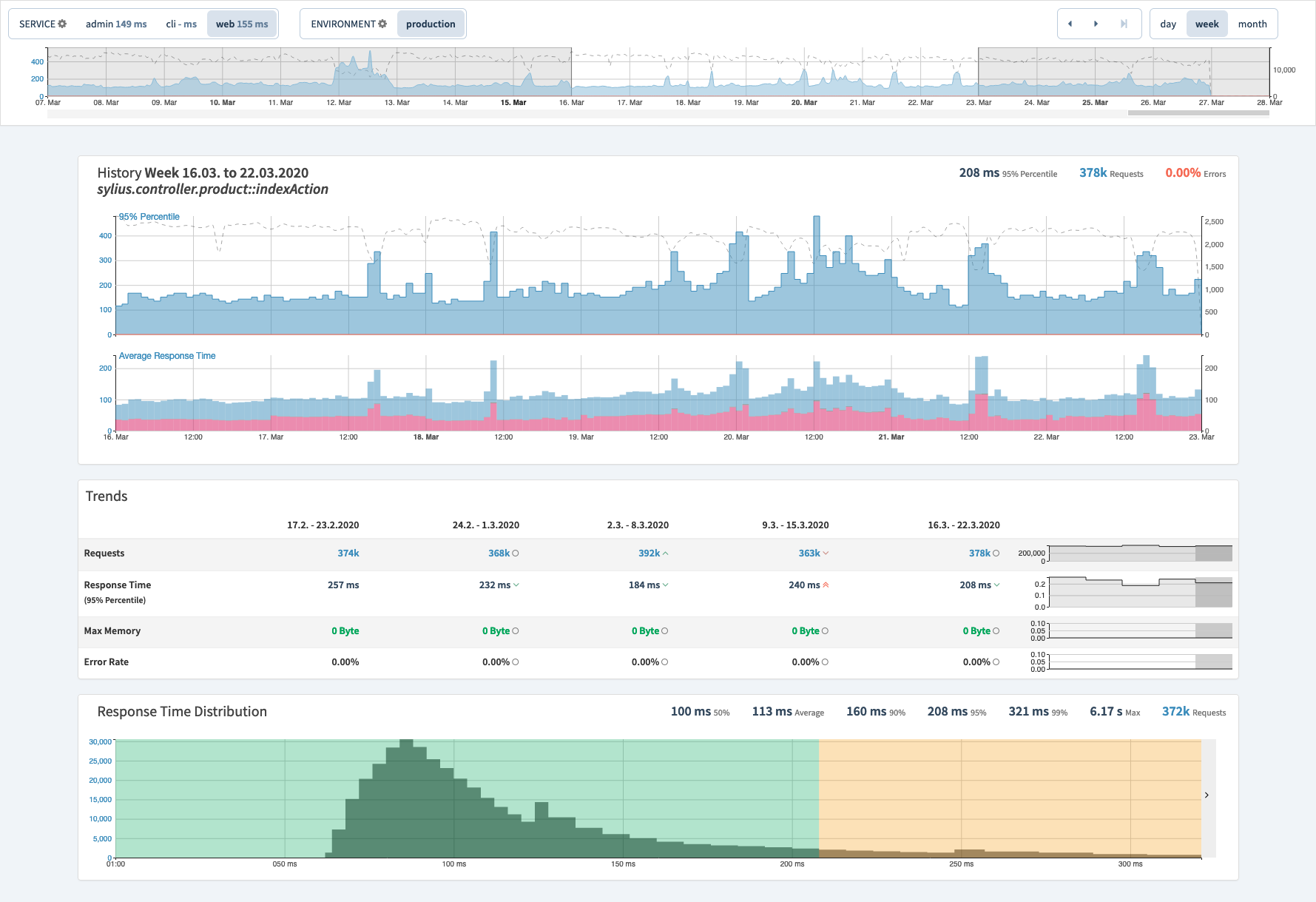
Drill-down Into a Transaction
If you click on a Transaction, you can drill-down into it to see a bit more context-specific information about it. At first glance, the page looks reasonably similar. The 95% Percentile and Average Response Time graphs are still located at the top of the page. However, the average response time graph is now focused around just this transaction, as you’d likely expect.
That said, if you scroll down, you’ll see that a new Response Time Distribution graph is available, underneath the Average Response Time graph. This shows the number of queries in a given response time band, such as those that took 50 - 100ms, and those that took 200 - 250 ms.
It also shows the total number of requests, the average response time, the maximum response time, and the response times for the 50th, 90th, 95th, and 99th percentiles.
Finally, you see a table of all the requests for the transaction. For each request, you see a number of pieces of information displayed, including:
-
The request’s response time
-
The amount of memory the request used
-
The request’s URL
-
The service and environment
-
The status code of the response; and
-
The layers which composed the request
You can click on each request to drill down even deeper, however, I’m not going to do so in this video, as it’s covered in the Timeline Profiler.
Now, one last thing, the requests listed in the table can be filtered by a number of criteria, including environment, service, date, and type and can be ordered in descending and ascending order of request date and response time.
The History Screen
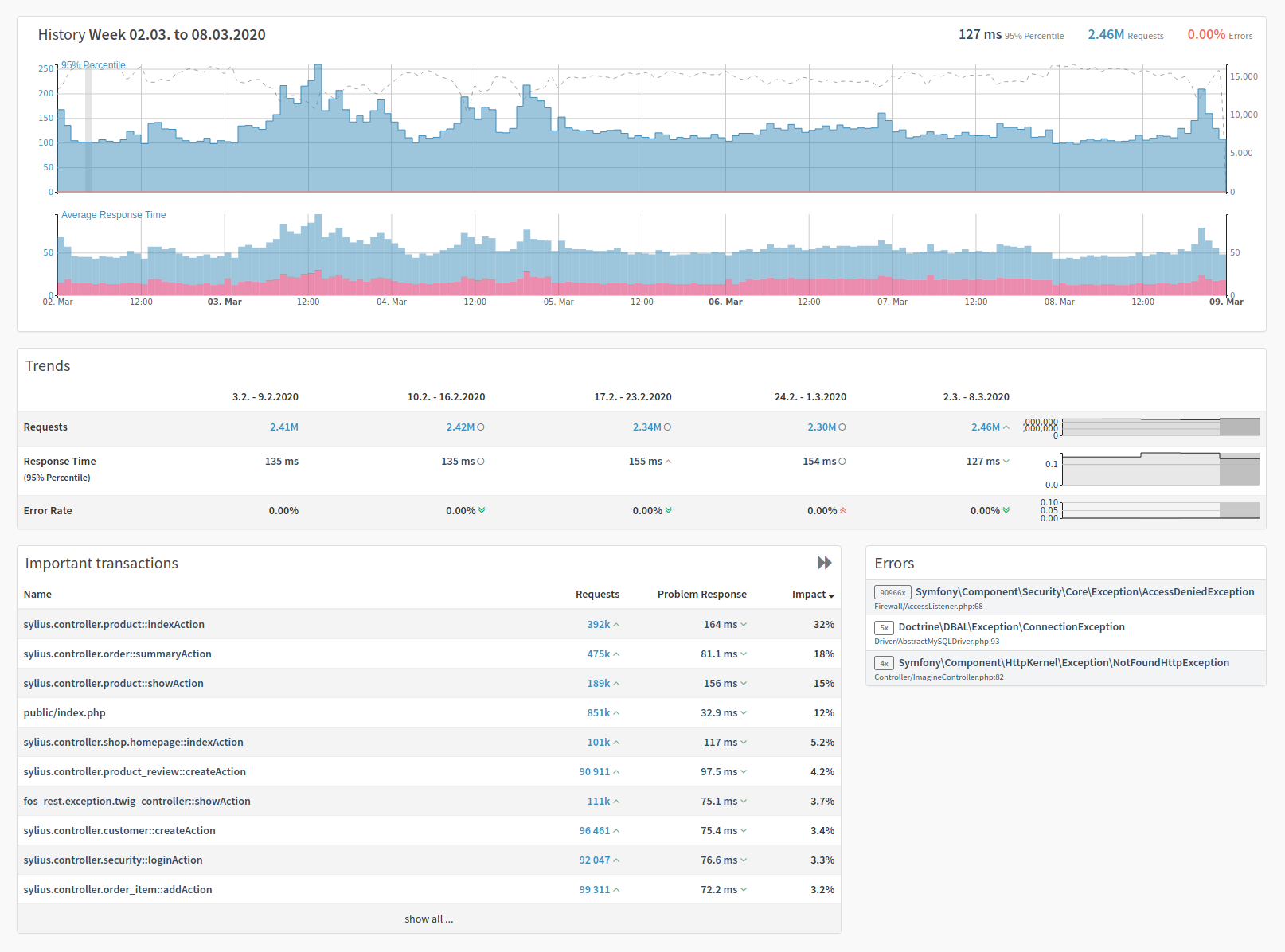
The History screen, which is accessible by clicking History in the main navigation menu, lets you navigate the historical data which Tideways sends as a weekly report directly. This is the main application screen — but at a much higher granularity, e.g., 1 hour based in the chart, 1 day or week based in general. It includes Trends, Important transactions, and Errors.
The history screen has almost all of the same top-level navigational controls as the performance screen, such as the service and environment switcher. The time frame switcher has been replaced with the ability to change the comparison periods between days, weeks, or months.
The trends section covers the Requests, Response Times (in the 95% percentile), and the Error Rates from your application in the time range selected. Important Transactions contains the transactions that have a high impact on your application. For each transaction, by default, you see three values, these are:
-
The number of requests received by the endpoint
-
The problem response time for the endpoint; and
-
The impact percentage. Impact is the share of all response times of this transaction in relation to all the transactions in the application or service.
The transactions are ordered in descending order of impact percentage. If you click the double-arrow icon in the top right of the box, the view expands and contain three additional columns, these are:
-
The maximum memory usage for the endpoint
-
The total failure count for the endpoint; and
-
Typical response time for the endpoint
Double-click the now left-facing double-arrow to compact the Trends section back to its original size.
| You can use the Tideways History API to retrieve this information as well. You can find out more in the History API section of the documentation. |
In Summary
And that has been a rapid introduction to monitoring in Tideways. It covered the main application performance screen, including the service & environment switcher, the history and time selector, the response times bar charts, and the transactions lists, and the history screen. It also introduced percentiles, what traces are, and how to configure traces.